This guide provides an overview of how to effectively use the Reporting Dashboard for Sales Reporting and Sales Pipeline analysis. By following the steps outlined, users can easily customise their reporting views to access historical data and upcoming figures across multiple branches. The guide also offers tips on utilising filters and interpreting data, making it an essential resource for anyone looking to enhance their sales reporting capabilities.
Please note you will need to have access to the Reporting Dashboard Module before being able to use this guide.
Details on how to do this are available here.
2. In the top navigation, click "Reporting"

3. In the sub-menu, click "Reporting Dashboard".

4. When you click into Reporting Dashboard, you will first see Sales Reporting.
By default, you will see figures from the current calendar month, and your user's branch.

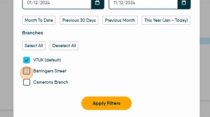
5. To view more branches, or a different date range, click "Filter By"

6. To change the date range, you can select one of the standard filters (Month to Date, Previous 30 Days, Previous Month, This Year) or select your own custom date range.

7. You can also select which branches you would like to view.
Click "Apply filters" when you have selected your preferences.
8. You will see your new filters detailed at the top of the page.

9. You will now be able to view the combined figures for all your selected branches within your selected date range.
If you are unsure of what any field shows, click the 'i' icon against the category title for more information.

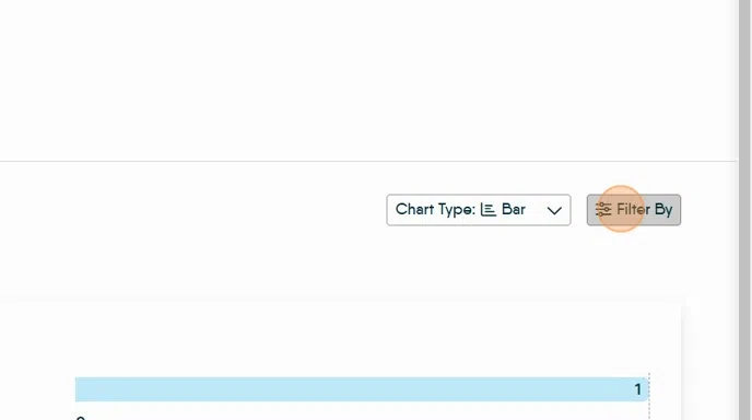
10. To view your selected branches separately, click "Chart Type"

11. Select the "Table" view

12. You will now see your reporting broken down by branch, in a table view.

Sales Pipeline Reporting
13. To view your Sales Pipeline, click the tab at the top of the page

14. By default, you will see only your user's branch.
Sales Pipeline does not have a date range and will show all upcoming figures.

15. To view more branches, click "Filter By" then select which branches you would like to view.
Click "Apply Filters"
16. You will now be able to view the combined figures for all your selected branches.
If you are unsure of what any field shows, click the 'i' icon against the category title for more information.

17. To view your selected branches separately, click "Chart Type"

18. Select the "Table" view

19. You will now see your reporting broken down by branch, in a table view.
